Emma Diaz on How to Use Colour in Your Home
In a corner of the Cotswolds, tucked behind the door of an 18th-century cottage, colour comes to life. There’s a kitchen with butter yellow walls and sage green cabinets; a bathroom with dusky pink panelling; and a sitting room made up of myriad shades that combine to create the Pantone equivalent of warm. This is the home of Colour Consultant Emma Diaz, who has made it her job to study the rainbow and bring its many hues into other people’s homes. A former stop motion animator, Diaz found a love of interiors when she began renovating her own house and documenting its progress on Instagram. Her account, followed by 84k design lovers (and counting), caught the eye of Edward Bulmer Paints, and in 2021 she became one of the brand’s first colour consultants. We caught up with the expert to discover her tips for decorating with colour.
Start with Your Favourite Colours
It might seem like an obvious first step, but Diaz notes that everyone is naturally drawn to certain tones, so narrowing down what you like (and what you don’t) is an easy way to begin curating a colour palette. “It’s scientifically built within us, due to how we all see colour differently,” she explains. “You may have an idea of what these colours are already – or even a colour group that stands out to you more than others, but my first piece of advice is to really take some time to think about this, as it will affect how you feel in your home.” She recommends putting your personal tastes first; try not to be swayed by Instagram, Pinterest or interior design magazines at this stage, and simply think about what you like instead.


Take Inspiration from your Home
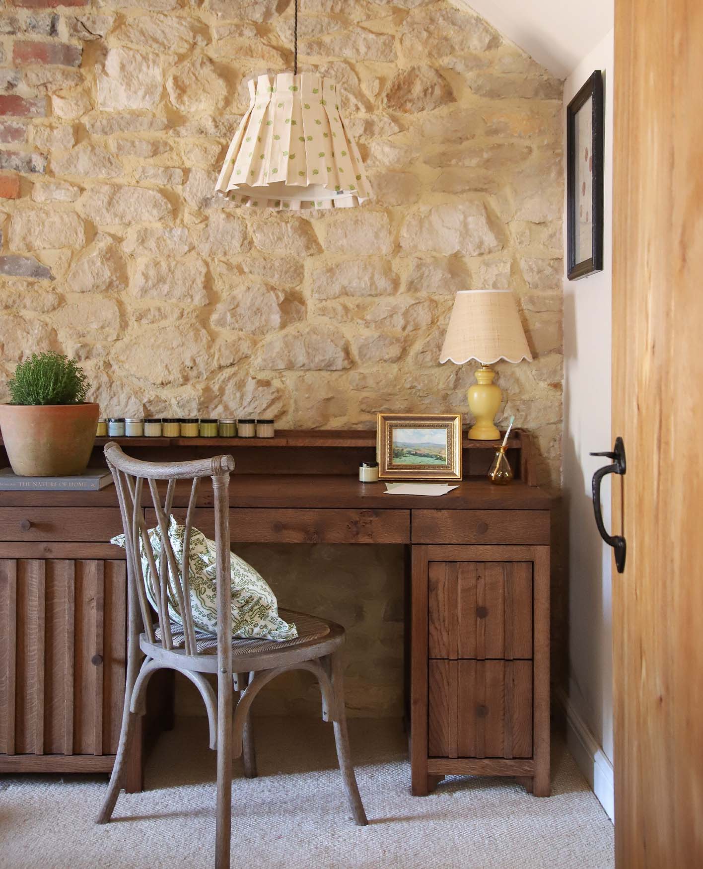
Another great place to begin is with the features that already exist in your home. This might mean the natural colours of the walls or woodwork, the lighting, a statement mantelpiece or even fabrics that you’ve already used within a room, such as curtains or a rug. “If there are features such as this that are staying, I always start with these points to gain inspiration and of course make sure the colours we use in the rest of the room are complementary,” Diaz explains. In her own home, she drew inspiration from the bones of the cottage itself, taking cues from the historic colours of the lime wash in the original stone walls to inform the palette for the rest of the space.
Tap into Your Emotional Side
Red for passion, blue for calm – colours have long been associated with different emotions, but Diaz says how we perceive them is much more personal than these stereotypes suggest. “Have you ever wondered why classrooms are often painted blue, or why schools use certain colours for their uniforms?” the consultant muses. “The right shade of blue can be a calming colour, but research has shown that, depending on the tone, it can also help you focus, improve concentration and stimulate discussion. Each colour has scientific properties such as these, but we all feel the benefit (and the adverse effects) differently, according to how our eyes perceive them.”
With this in mind, the consultant dismisses the idea that there’s a perfect colour scheme for each room in the house; it’s not about what should and shouldn’t be in a kitchen, for example, but how you personally want your kitchen to feel, and which colours will evoke that feeling for you. “Many people say not to use yellow in a bedroom as it’s seen as an energising shade and some people may find it difficult to relax if they are surrounded by yellow – but it really comes down to how you as an individual perceive colour,” she says. “I love a deep shade of red; I see it as flamboyant, luxurious and passionate – yet another person may perceive it has a negative colour, associated with danger and anger. This shows we all have different associations with colour.”


Don’t be Afraid of Primary Colours
The term ‘primary colours’ immediately conjures images of shockingly bright red, blue and yellow, but, as the source of all other shades, these hues can be a good springboard for your palette. Diaz recommends simply looking for the right tones for you. For homes with a more subtle design style, for example, she suggests using lighter shades on the walls, such as neutrals, and bringing in brighter hues through accessories. She also recommends using the “tonal harmony technique”, for which “you pair shades of the same colour, but use a different tone to create a more harmonious feel”. “For a more eclectic look, you can bring in contrasting colours,” she adds. “For example, I’ve used red on our bannisters, because I just wanted a pop of colour – anymore and it would feel too intense for me – yellow on the walls and my blue Aulnay Sideboard from OKA, all in the same space.”


Be Bold with Furniture and Accessories
Don’t feel you have to stick to paint charts; a great way to bring colour into your home is by adding accents through furniture and accessories. In Diaz’s home, her sitting room celebrates her love of red through the embroidery on her favourite Sheki Ottoman from OKA (“A showstopper of a piece”), the cushions arranged on her dusky pink sofa and the wall art and lampshades that decorate the space. “Don’t worry if you love a strong colour,” she says, “as even if you don’t feel like this would work on the walls, it can be incorporated in smaller pops of colour with fabrics, accessories or even woodwork.”
Accessories are also a useful tool when it comes to seasonal switch ups. “You may want to add richer, autumnal shades to a space in autumn and winter to make it feel more cosy, yet freshen it up in spring and summer with fresh flowers and accessories in lighter colours,” the consultant says. But, she adds, you needn’t be concerned with overhauling your entire space every season; the main goal is to find a palette that you love. “Really, I feel that if you believe in a colour and you think it works, it will work any time of the year.”
To discover more of Emma Diaz’s world, follow her on Instagram @byemmadiaz