When it comes to spring colour schemes, soft pastels and delicate florals often take centre stage. But spring is also a season of renewal, a time to look beyond the expected and explore colour in new, thoughtful ways. Drawing on the mood and energy of our new collection, these are some of the most exciting combinations for spring 2026. Here’s to a season full of colour and light.


Published 19 February 2026 | Last Modified 19 February 2026
5 Colour Schemes to Inspire Your Spring Interiors


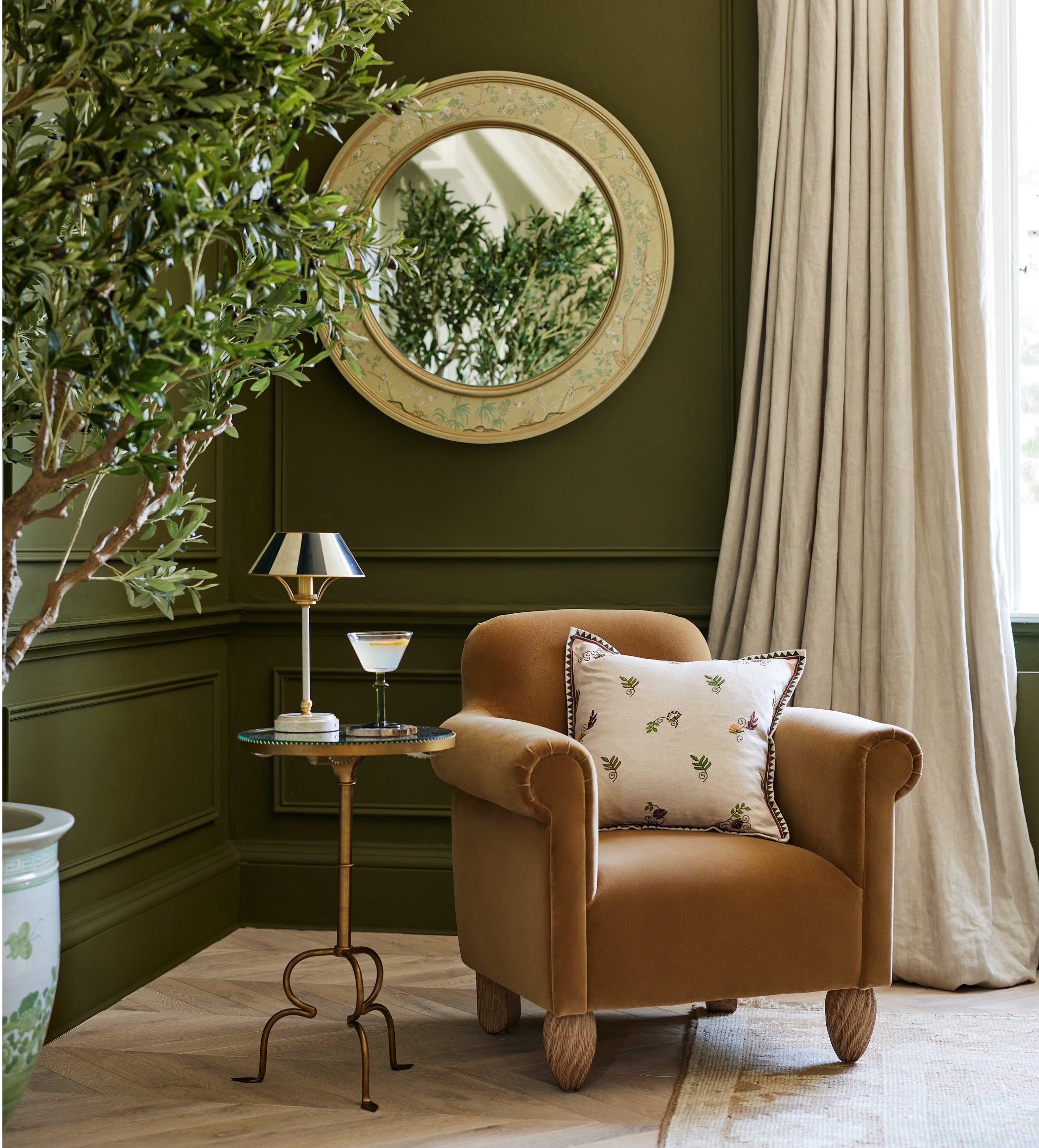
Layer in Apricot Hues
Apricot is the definition of spring colour in full bloom. It’s warm without being overpowering, and effortlessly uplifting. This season, it’s the ideal way to add a touch of warmth to your living spaces. Layering different shades and textures of apricot is key to achieving a subtle, curated effect that feels cohesive yet fresh and playful.
Featured in this article
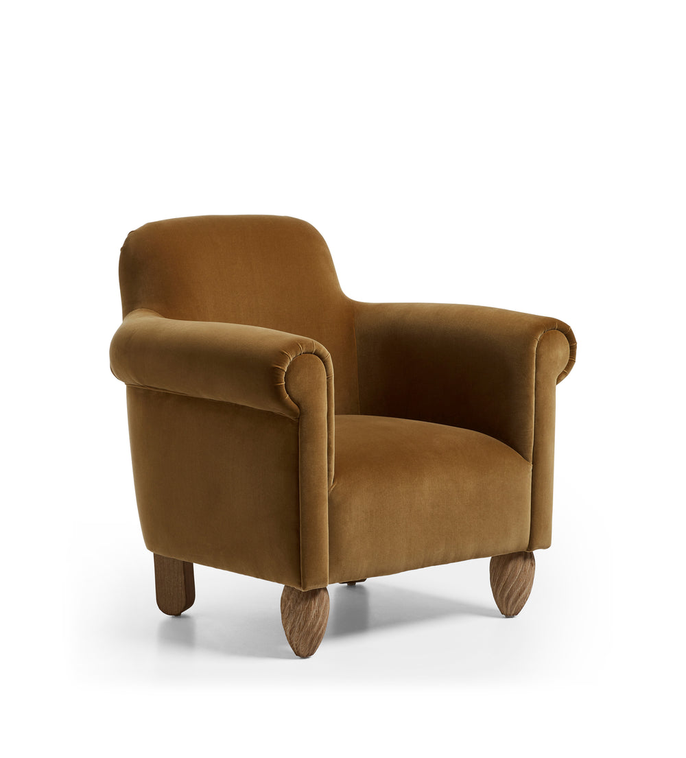
New


Coleridge Velvet 3-Seater Sofa - Apricot
£2,495.00


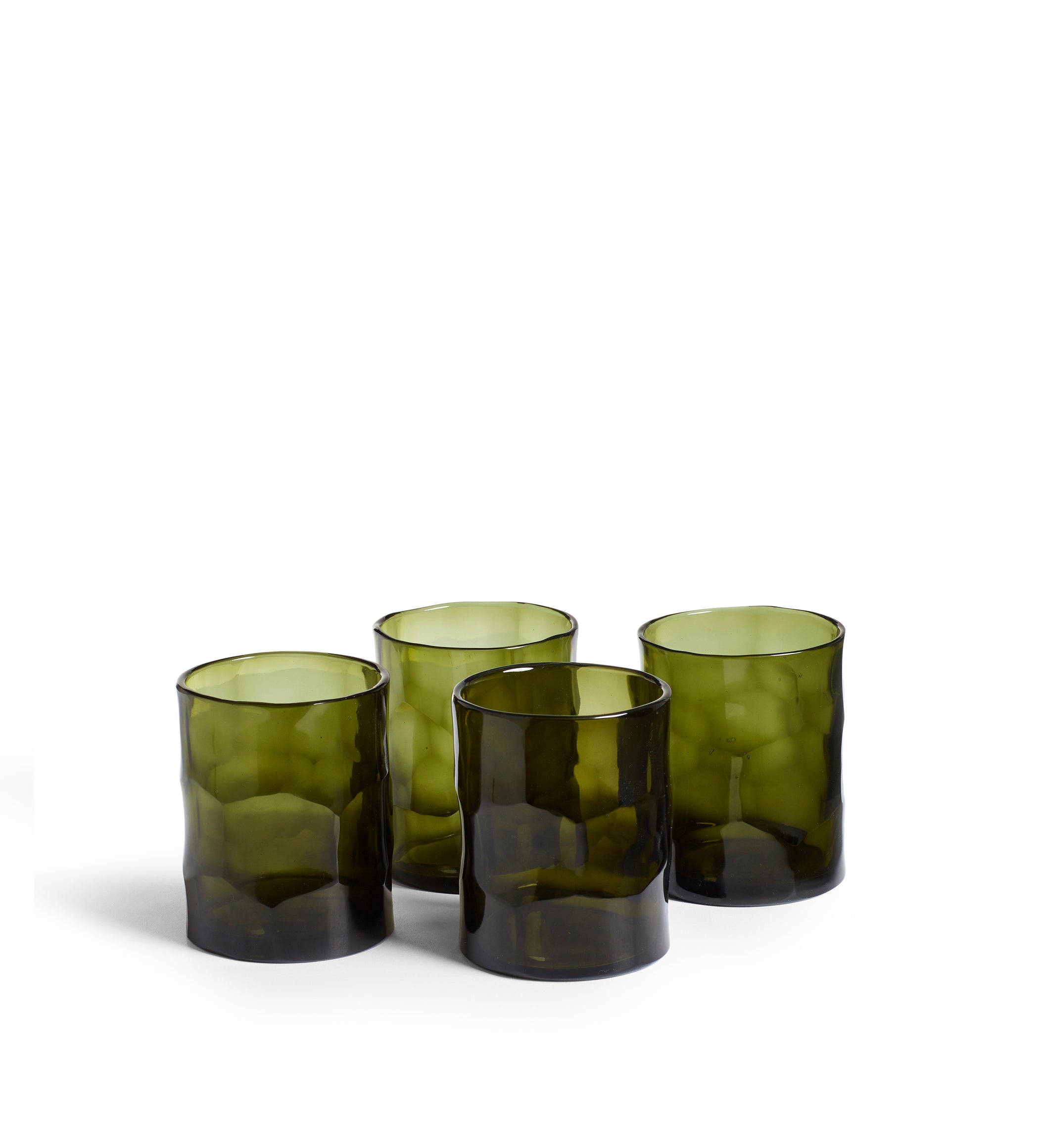

Chaar Tumblers - Set of Four - Green
Handmade
£60.00


Refresh with Seafoam
Seafoam brings an instant sense of serenity and natural beauty to spring interiors. Evoking the feeling of ocean mist, it’s the perfect colour to accompany the gradual shift from indoor to outdoor living. Cushion covers are an easy place to start, whether layered across a sofa indoors or mixed with neutrals outdoors. Let seafoam work its magic in making a room feel brighter and renewed after winter.


Ground with Greens
Greens have a timeless quality that makes them especially at home in spring interiors. Embodying the awakening of nature, greens anchor a room, simultaneously offering depth and optimism. A leather ottoman or console table in spruce adds weight and character, while cushion covers in putting green can add a more light and relaxed tone.


New
oka icon
oka icon


Lift with Yellows
Yellow is a quintessentially spring colour that has a quiet, transformative effect on a space when used right. Indian Yellow and Ochre create a warm and grounding atmosphere, rather than bright and overpowering yellows. Cushion covers are an easy way to introduce the colour, while throws bring an extra layer of warmth and texture to drape over sofas or armchairs. The key is to let yellow act as an accent rather than a statement.


Calm with Blues
Blue has a timeless ability to bring serenity and balance to any interior. Its cooler tones offer a counterpoint to warmer colours in your palette, creating spaces that feel composed and considered. In our new spring collection, air force blue is the star of this mood. Cushions in this colourway can be scattered across sofas, while lampshades with air force blue detailing ensures spaces don’t become heavy or wintery.


How to Create a ‘Winter Garden’ for Cosying Up
Summer may be a distant memory, but that doesn’t mean you can’t still create a cosy and social space outdoors...
Interested in more inspiration?
From tips and tricks to decorating advice and expert know-how, we've got plenty of bright ideas for the home and garden.

21 July 2026
Behind the Designs: OKA x Lewis & Wood
Bedrooms are becoming more layered and decorative spaces. Once seen simply as a place to sleep, they are now designed with the same...

2 June 2026
Spotlight on The Ocellus Leather Mini Bar
From garden cocktails to countryside picnics, an iconic OKA design returns. Thoughtfully designed, the portable drinks cabinet brings elegance and...

28 April 2026
How to Create Flexible Outdoor Living Spaces
Early summer brings a new rhythm to outdoor spaces. Garden terraces, balconies and patios become places to sit, work, dine...

21 April 2026
Wallpaper - Your Questions Answered
After 27 years of creating patterns across upholstery, cushions and homeware, wallpaper felt like a natural progression. Our first collection...

20 April 2026
Behind the Designs: The Story of Our First Wallpaper Collection
For the first time in our 27-year history, we’ve brought some of our most recognisable prints to wallpaper. Many of...

