The Evolution of our Signature Patterns
Since our founding, bold pattern has been an essential feature of our collections. With a maximalist aesthetic at the core of our ethos, we’ve crafted unique prints that bring timeless silhouettes to life in characterful – and colourful – ways. To do so, our Co-Founder and Creative Director Sue Jones and her team keep their eyes peeled for inspiration on a daily basis; an antique rug could be the springboard to a new range of best-selling soft furnishings, or a motif from nature might be the starting point of an exciting upholstery design. “Over the years I’ve learnt never to close my eyes or mind to anything, as inspiration can pop out from the most unexpected of places,” says Sue. “It can come from anywhere and everywhere.”
Indeed, even once a print has been designed, lightbulb moments persist – many of our patterns have been adapted to feature across multiple furniture pieces and accessories , involving clever design and craftsmanship skills to manipulate motifs to fit new shapes and uses. “My favourite part of my job is sitting and creating different combinations, and putting colours and patterns together,” says Sha Sarda, our Product Design and Development Manager who specialises in homeware. “It’s a joy to see something work many times over.” Keen to hear more about how our patterns are developed, we caught up with Sha to discover the story behind four of our community’s favourite prints.


The Areca Print
Nature is a constant calling card for our team, who look to its unusual forms and striking colours that can be emulated on accessories and furniture. Evoking thoughts of sun-drenched beaches, the palm motif is a perennial favourite, and so our leafy Areca print has naturally become a key feature of our collection. “The way we’ve used the palm motif for our Areca Range is quite modern; it has a nice, simple appeal to it, especially with the stripe running between the leaves on the cushion cover,” Sha says. “The scale is perfect, and the gap between the fronds helps to break up the design.”
Printed on linen, the leaves have been recoloured in shades you wouldn’t traditionally find in foliage – vibrant oranges, ruby reds and ocean blues – to complement our range of velvet cushion covers, providing a colourful synergy throughout our collection and allowing you to mix and match your favourite OKA pieces to your heart’s content. “The colours in our collection are carefully considered to complement one another, with strong visual impact achieved through the use of bold shades, contrasting tones and fluid textures,” Sha explains.
So popular is the pattern that for our Spring 2023 Collection, we brought the design to one of our other much-loved pieces: The Coleridge Armchair. This fan favourite can now be found upholstered in a printed linen and adorned with the leafy fronds of our Areca palm. “Adapting the pattern for furniture upholstery is quite tricky, but our craftspeople have done a great job in making it work,” says Sha. “They took the lead from us on how to go about it, as well as how to ensure minimum wastage despite the pattern requiring different panels of fabric. It is a challenging process, but you’d never know it – the pattern looks seamless.”


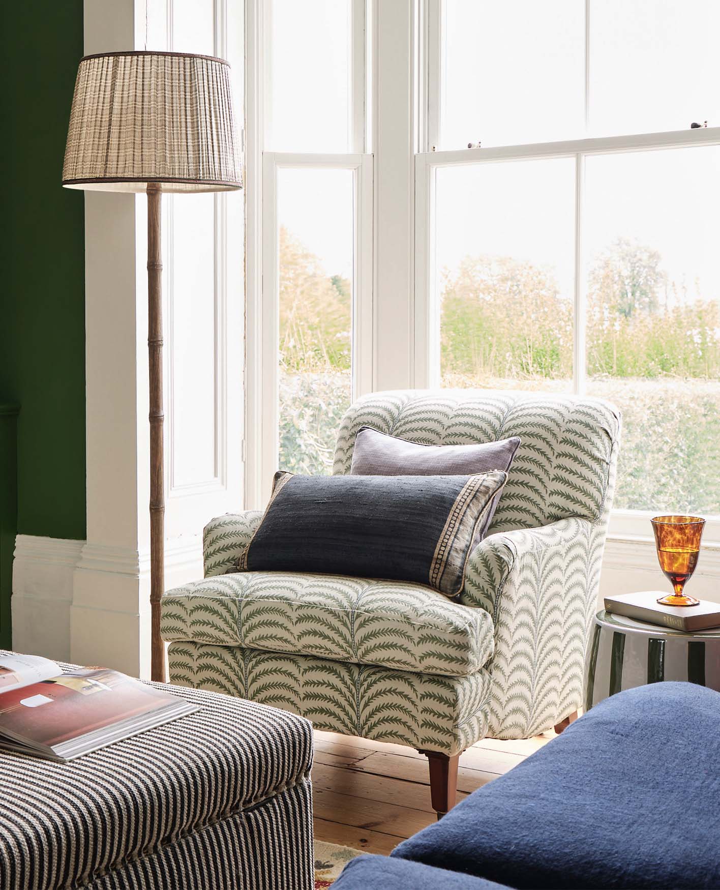
The Sheki Print
A medley of intricate leaves and floral motifs spring from the undulating vines that snake their way along the surface of our Sheki Rug. Some are screen printed, others hand embroidered – two craftsmanship techniques combining to create this dancing display of nature. It was this skilful show of artisanal prowess that first caught Sue’s eye when she spotted the original design on an antique rug, which would later become the starting point of our Sheki Range. First adapted as a multicoloured rug, and then redesigned in a fresh Olive colourway for a cleaner look, the beautiful pattern proved so popular that it felt only natural to introduce the print to other product ranges, too. Today, you’ll find it on an ottoman, throw, cushion cover and set of box files, as well as in our Tarma Range of loveseats and armchairs.
Texture in interior design is key, so it’s little wonder that this unusual pairing of fabric printing and intricate weaving has been so well received by our community. “The combination of the screen printing and hand embroidery makes the Sheki pattern so unique,” Sha agrees. “It gives it such a nice textural and folksy look, but also feels very modern at the same time. That’s what I find so interesting about it.”
Decorating with pattern is all about contrasts, so when adapting the style for an ottoman, Sue and her team added a striped border to “break up the design and give it a nice edge,” says Sha. “The print can look quite traditional on its own, so the stripe gives it a contemporary twist.” It’s the perfect combination, and one we’ve continued throughout the Sheki Range – you’ll find the different patterns featuring on our Set of Three Sheki Box Files, as well as on our cushion cover and throw.


The Ocellus Print
A small piece of cloth was the starting point of our Ocellus Range, which features a repeated peacock feather pattern with velvet embroidery as the star feature. Said cloth showcased the unusual woven embellishment we have replicated on our Ocellus Cushion Cover, which uses a melange of velvet threads in different colours to create an eye-catching, shimmery effect. “Ocellus has a well-balanced motif that is beautifully designed with a hand-embroidered centre, giving it tactile and visual interest,” Sha says. “The contrast with the richly textured background makes it bold and appealing at the same time.”
While the embroidery draws the attention on soft furnishings, elsewhere in the range we’ve used the elegant silhouette of the peacock feather as a statement feature – you’ll not only find it on a selection of office accessories, such as our box files, wastepaper bin and tissue box and tray, but also on the beautiful shopping bags your OKA purchases are presented in. “I think a well-designed print should have versatility and be adaptable to different contexts and applications,” says Sha of the Ocellus’ appeal. “It should be able to work across different product categories and be modified for different purposes, while maintaining its aesthetic appeal. The Ocellus is timeless yet contemporary, with striking texture as the background, which makes it such an OKA classic.”


The Nesbitt Print
The Nesbitt has a hypnotic pattern that draws the eye, made all the more alluring by its earthy Moss, Red and Navy colourways. Originally a rug, the range has since expanded to include matching cushion covers, throws and upholstered trunks and ottomans, the latter coming complete with metal stud detailing. “The distressed screen-printing of the Nesbitt is quite a skilled and laborious job,” says Sha. “It’s difficult to maintain the quality and colour consistency across production, but it’s something that OKA does well, giving colour to furniture pieces that you wouldn’t necessarily see elsewhere. This pattern is quite bold in that sense, but the studs on the upholstered pieces give a metallic touch that breaks up the design.”
Colour consistency is a key element of the production process, with much time focused on ensuring the hues appear as desired. Even with the skilful execution deployed by OKA artisans, there is always some variation expected between each design – as with all handcrafted pieces, it’s impossible to ensure complete uniformity, but this is simply part of the Nesbitt’s charm. Made with love and care, and featuring individual characteristics, every piece is beautifully unique.