How to add colour with cushions
Looking for the hero to add colour to your decorating story? Don’t overlook the humble cushion. Allowing you to sidestep the divisive discussions created by subtle shade differences on paint charts – to an extent, anyway – this simple-yet-effective soft furnishing can add a pop of colour (and pattern), without forcing you to commit to a full room scheme. Yes, it’s true what they say: a scattering of plump pillows in myriad hues can alter a space in an instant. But where to begin when it comes to selecting shades or artfully arranging cushions? Our expert Interior Designers, Antoni Roig and Sarina Hawkins, share their tips on how to add colour with cushions.
Stay open-minded
First things first, don’t shut down a colour option out of hand. We all have shades that we instinctively reach for, and those we prefer to avoid, but allowing yourself to be objective will give you greater scope for creativity. “Don’t close the door on any colour, because you might be missing out,” advises Roig. “That’s a mistake our clients often make. The cushions aren’t there to dictate the room, they’re there to enhance it, so try and stay open-minded.”
This attitude will help you find an arrangement that will endure; think long-term to land on a colour scheme that you will like for years to come. “Understand where you are, who you are and what moment in time you’re in, in order to understand whether these pieces will be with you in a couple of years, or just temporarily,” says Roig. “That has a big impact [on your choices].”
Use cushions to emulate your environment
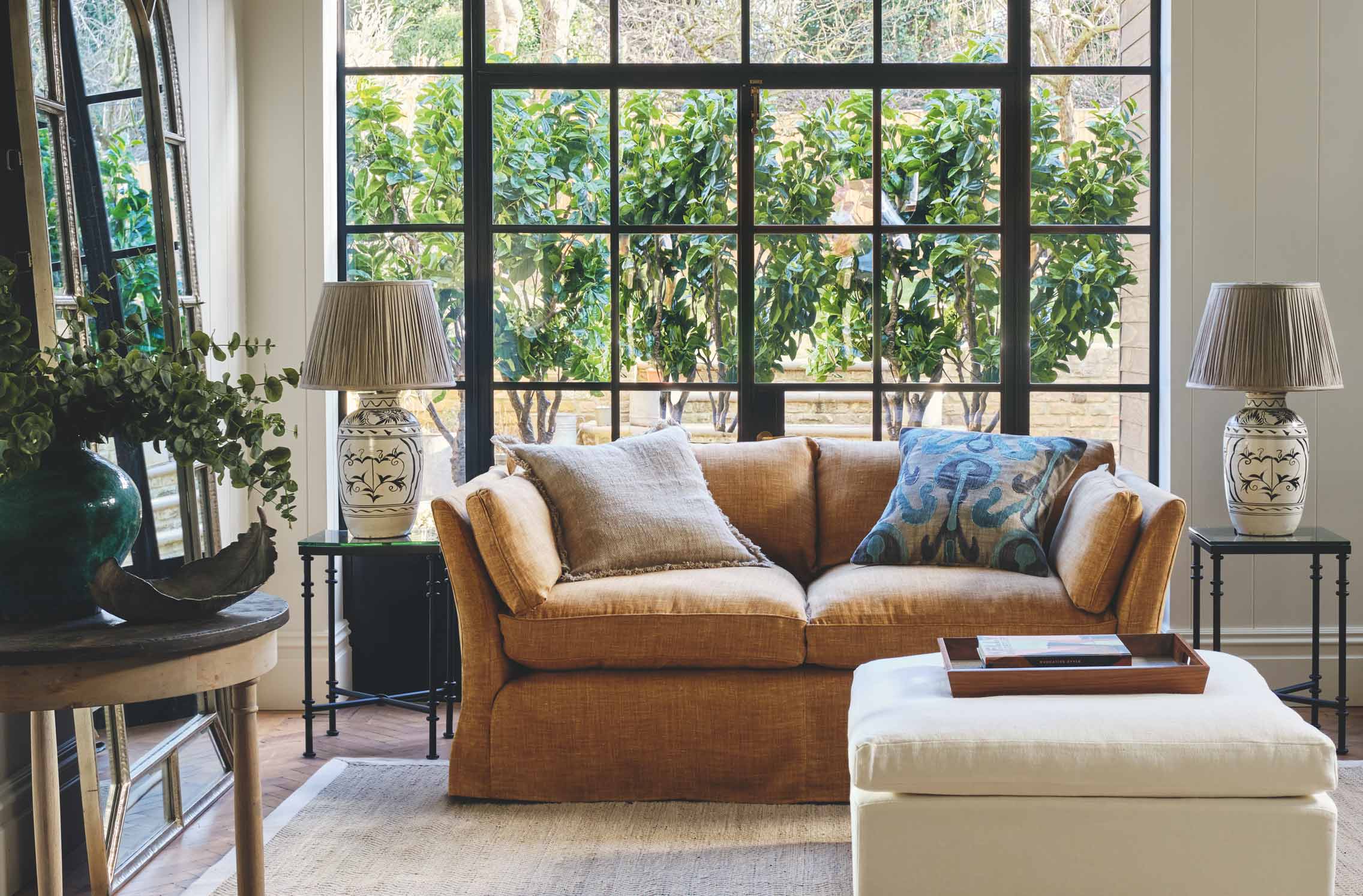
Whether you’re decorating a London townhouse or a holiday home on the Amalfi Coast, your interiors should echo your surroundings. “You want your cushions to evoke a certain feeling,” Hawkins explains. “You can mix and match colours, textures and patterns, but you need to make sure the arrangement summons a certain ambience.”
Start by considering the natural light in your property – this will affect how the colours of your cushions appear. “In sunnier climates, colours will appear much brighter, even in the winter,” explains Hawkins. If you’re decorating in a warmer location, opt for bright shades such as turquoise, yellow or pink. In a place that experiences all the seasons, select tones that work all year around. “Warm colours, such as orange or burnt hues, are easiest,” says Roig. “You can really mix those shades in summer and winter.”
Experiment with texture
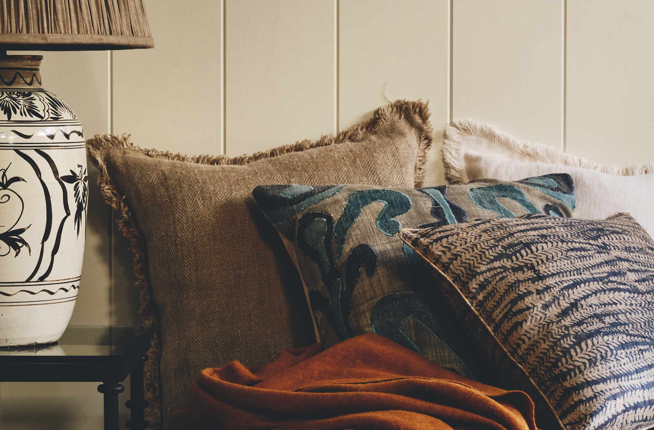
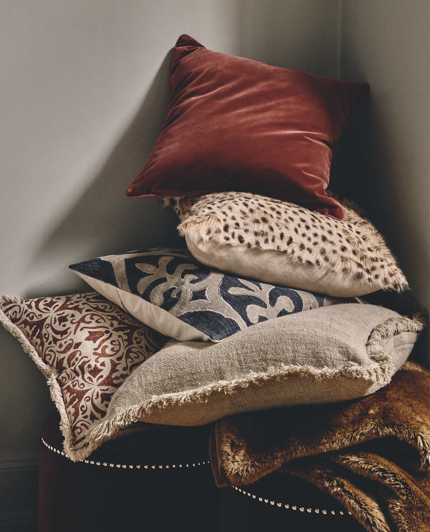
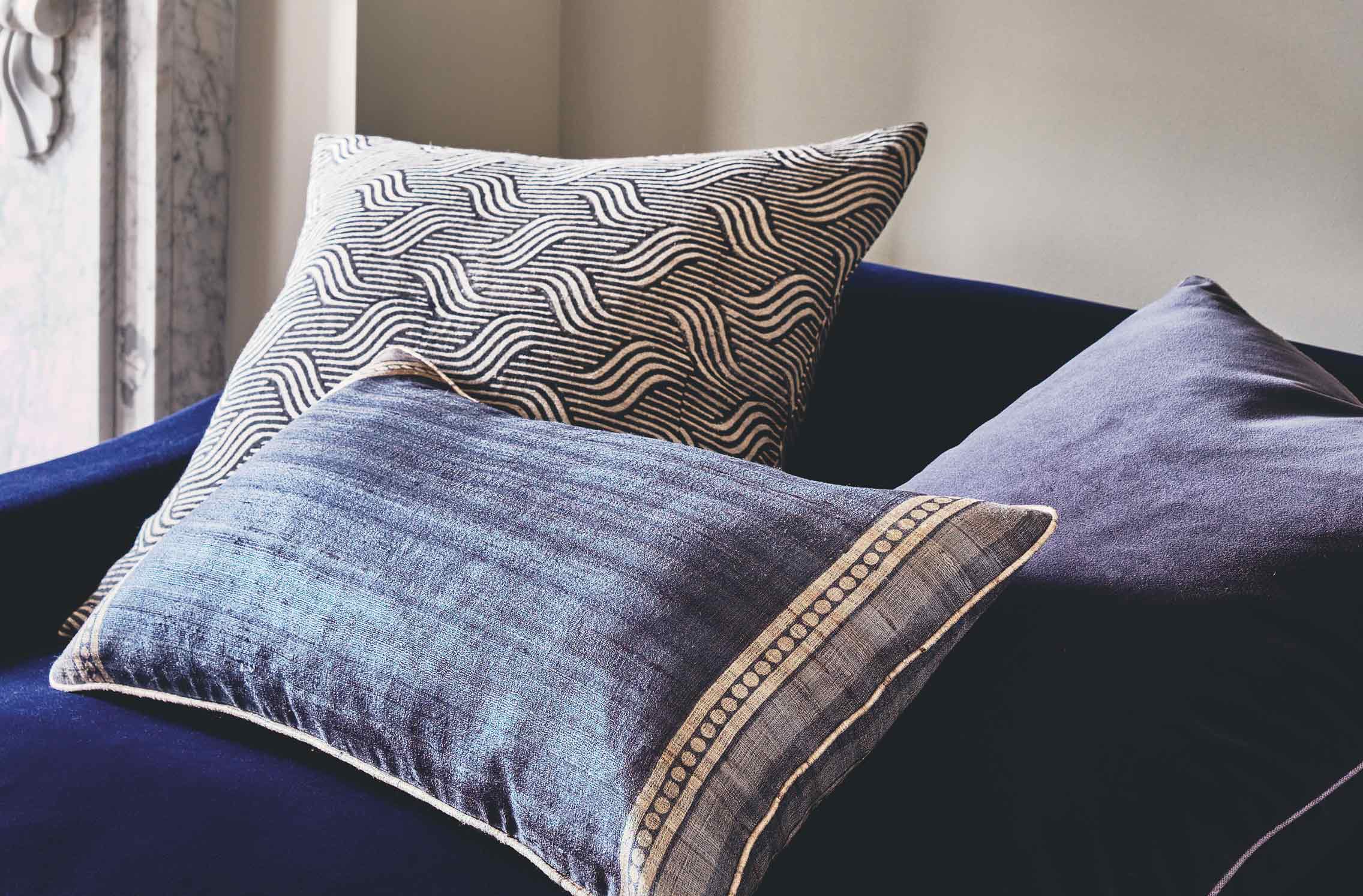
While certain colours may be better suited to certain climates, you needn’t be afraid to experiment with texture, says Roig – no matter where in the world you are. “Who said no to velvet cushions in the summer? I’ve decorated a whole terrace with turquoise velvet cushions in Cap d’Antibes,” he says. “Remove any myths and phobias. Just because it’s velvet doesn’t mean it’s heavy; it can add a real vibrancy.”
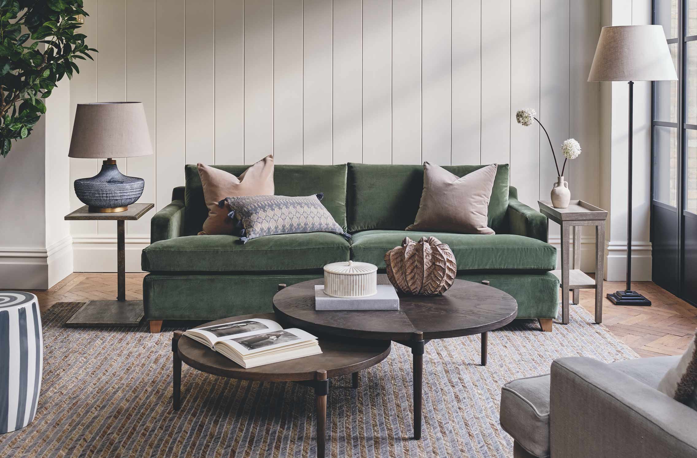
“With cushions, I think it’s always really important to have a good balance between colour and texture,” Hawkins agrees. “You don’t want them to be too samey, but you do want them to be complementary.” Think supple velvets paired with stonewashed linens, and cottons teamed with tactile cashmere. Tassels, trims and textured appliqué will add points of interest too, and will give you opportunities to experiment with colour – try picking out the scarlet red of a cushion’s embroidery, for example, and emulating it elsewhere in your arrangement.
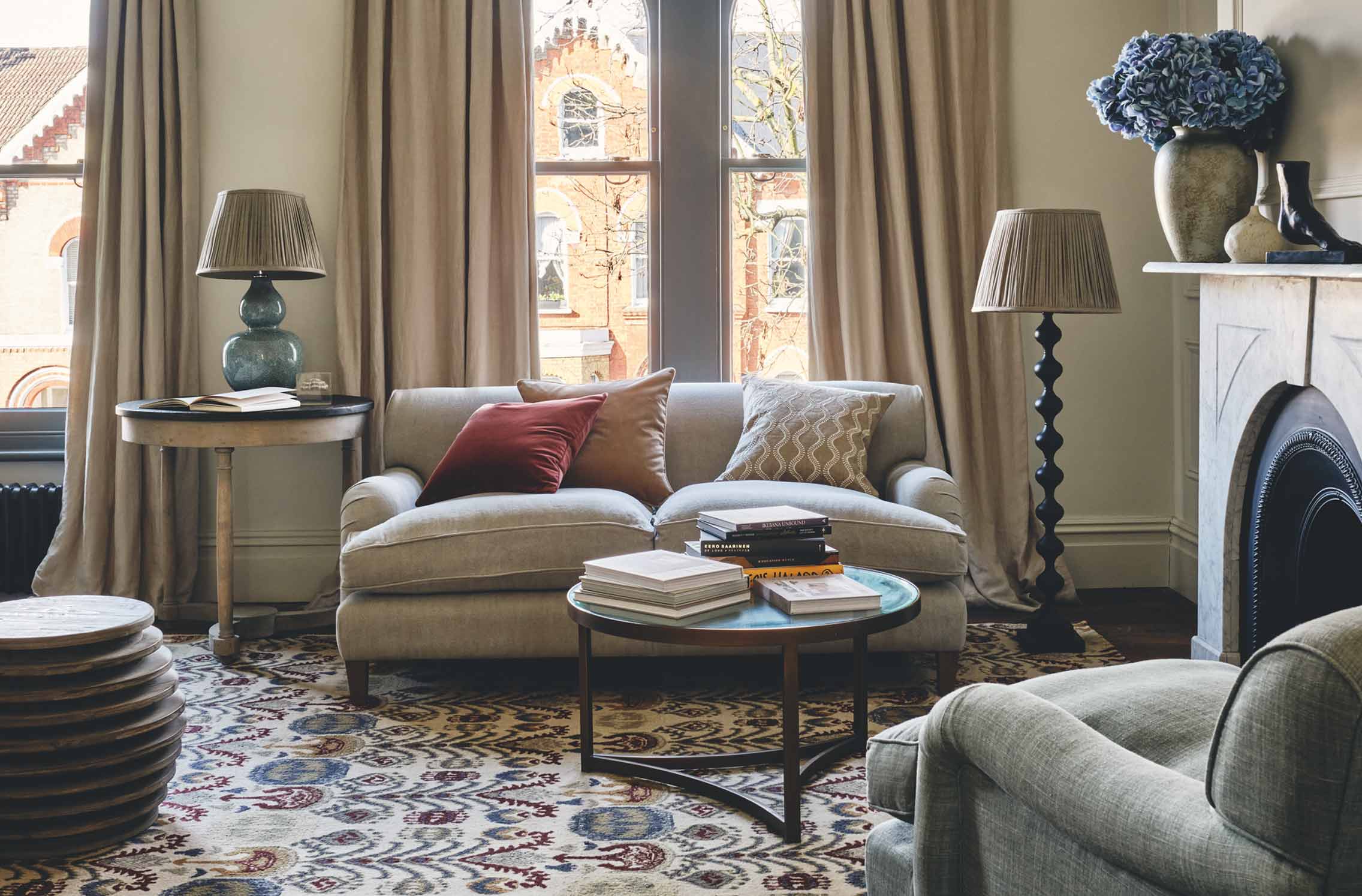
Complement rather than colour match
Rather than using cushions to add extra layers of the hues already in play in a decorating scheme, the trick, say Roig and Hawkins, is to accessorise with complementary shades. Look to pieces of art and décor, and consider tones that will elevate the colours found in these. Whatever you do though, don’t try to emulate their tones exactly. “I find it a tremendous mistake to pull colours [directly] from a piece of artwork,” Roig explains. “You’re taking away from something beautiful.”
Hawkins agrees on this point, adding: “It’s impossible to completely colour match, and if you can’t get the exact same shade it just looks like something hasn’t really worked. I prefer to choose a colour that will make an artwork stand out.”
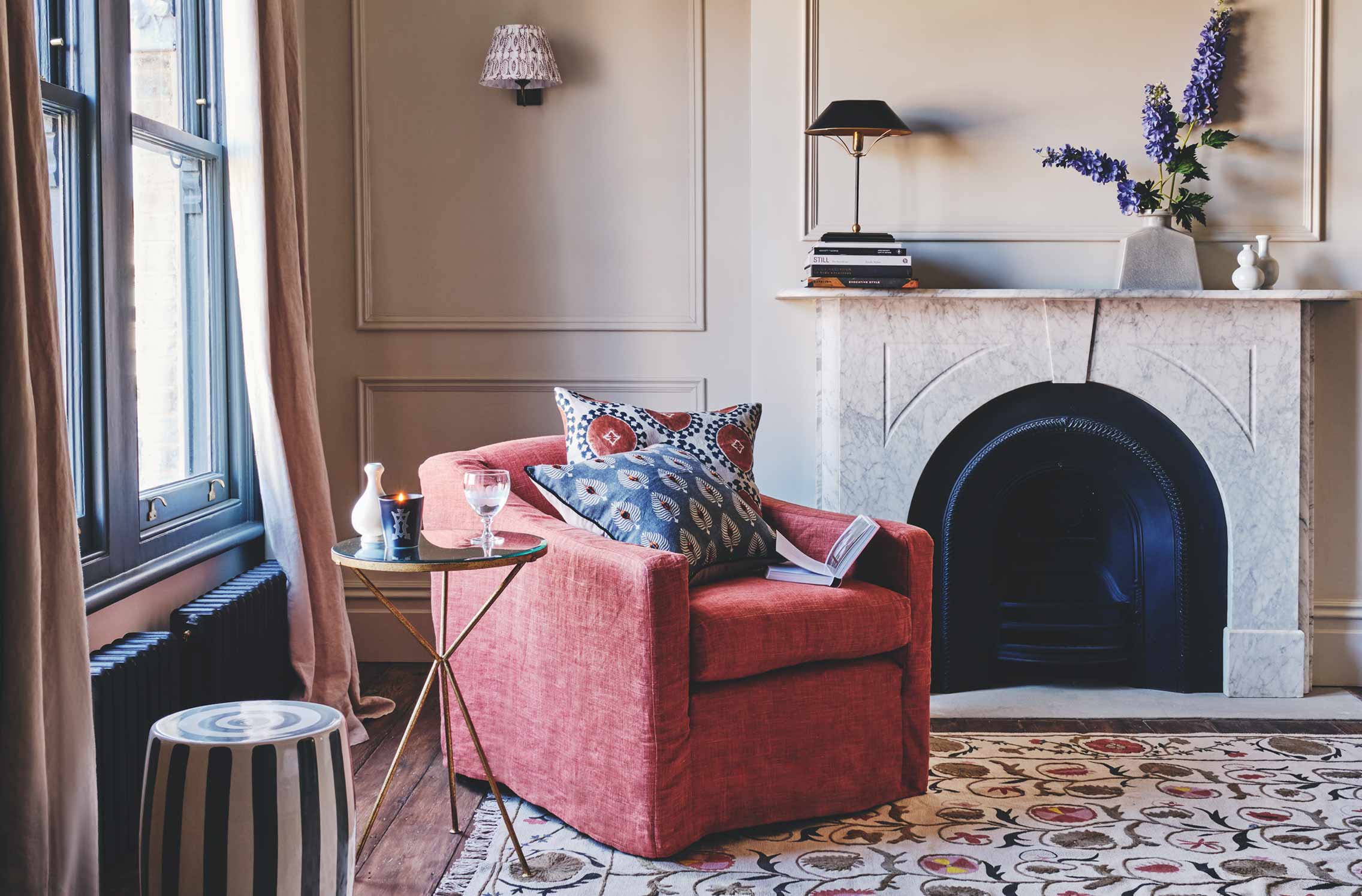
For those working with a relatively neutral scheme, Hawkins suggests letting your window act as a real-life artwork, and seeking inspiration beyond the confines of your space. “If a room looks out onto the garden, I would pick colours reflected in the flowers and plants outside,” she says. Select tones that can be easily emulated with cushions, such as the verdant green of a freshly-cut lawn, or the subtle pinks and peaches of flower petals.
Really commit to a theme
Simply put, a half-hearted attempt at a vibrant arrangement will look incomplete; if you’re braving a brighter colour scheme, commit. “Don’t buy two cushion covers today, and two after the summer, because you weren’t sure; do it now and see it all together,” says Roig.
Hawkins agrees that you need to be brave. “If you walk into a room and see just one or two crazy cushions, you can usually see what somebody is trying to do – but it doesn’t really work because they’ve just dipped their toe in,” she says. “If you’re going to go bold, you’ve got to go all the way. At the end of the day, it’s just a cushion; you can always change the cover if you decide it’s too much.”
For those who cannot be swayed from a more muted scheme, however, printed cushions with small pops of colour are an effective way to brighten your interior in a more subtle way. “We have quite a lot of cushions that have a neutral linen base with lovely dashes or dots on them,” says Hawkins. “Although they’re more pared-back, they’ve got a [colourful] point of interest – whether that’s a print or a couple of tassels.”
Think about style, scale and placement
While colour, print and texture may be at the forefront of your mind when purchasing cushions, how you intend to arrange them should also be a key consideration. One useful thing to note, according to Roig, is that the brighter, bolder and bigger the cushion, the less need there is for a curated arrangement. Meaning, don’t shy away from singular statement pieces. “Those are easiest designs, because one cushion does the job,” he explains. “Choose a statement style to go on an armchair or sofa on its own; it doesn’t need to be an arrangement. We have a lot of cushions like that at OKA.” In fact, with more than 200 designs to choose from, you’ll be spoilt for choice…