How to Mix and Match Patterns
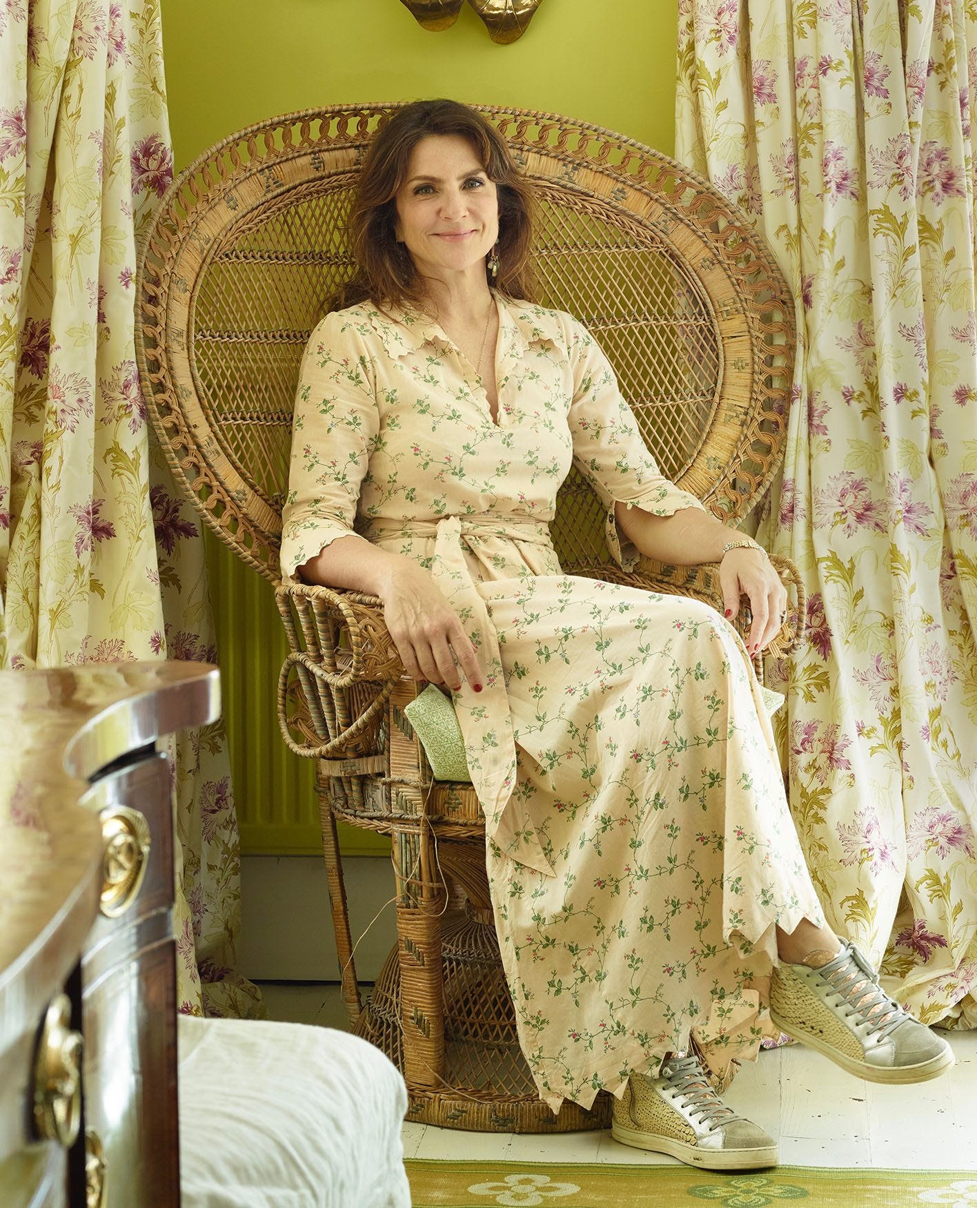
While for some introducing pattern to a home may feel like a bold step, for Sarah Vanrenen it’s an essential element in creating a space that feels characterful and lived in. Through her studio Vanrenen GW Designs, she conceives cheerful schemes that celebrate a rainbow palette of prints; her projects are never complete – nor indeed do they even begin – without a healthy dose of pattern and colour. She attributes her love of all things bold to a childhood spent in South Africa where, with the help of her mother the interior decorator Penny Morrison – for whom she designs a vibrant collection of fabric and wallpaper – she found a passion for the brighter side of life. “I think people from the Southern Hemisphere tend to be somehow bolder, in every way,” she says. “I crave colour, even if it is contrasted with calm cream or white, because it genuinely makes me happy.”
This joy is evident in each of the homes she designs, where shades are always cheerful and prints perfectly paired. It’s for the latter that we turned to Vanrenen for advice, calling on her expertise to answer a fundamental design conundrum: the dos and don’ts of pairing prints. Read on to discover her tips on how to mix patterns like an interior designer.


Start with Scale
Stripes, animal prints, polka dots, florals – there are so many great prints to play with, but how to bring them together in a way that feels both eclectic and cohesive? It’s not about shape or style, says Vanrenen, but simply a case of contrasting scale; when it comes to prints, size really does matter. “The main thing that you have to bear in mind is that the scale needs to be different,” the designer explains. “Medium and large-scale prints work with small ones. My favourite OKA prints are the Pattani Eclipse, Nostell Diamonds and Carlina, as they work well together but are small enough that they are easy to mix with most other patterns.”
Paying attention to the flow of a print can also make a difference; if one print is static, pair it with a design that has a little more movement. “It helps if patterns are very different and not too swirly or busy next to each other; geometric prints work with meandering prints, side by side,” Vanrenen says. “For example, a stripe can be a calmer background pattern, and you could add a large-scale floral cushion on top.”
Think Big
When considering how to mix fabric patterns in a room, Vanrenen likes to begin with the big things that will immediately draw the eye. “I would probably start with a wallpaper or whatever fabric I’m choosing for the main upholstery, such as the curtains or sofa fabric,” she explains. Once you’ve made your decision, you can use this to inform the rest of your space, bringing in different prints that will complement and even elevate your original choice. “You can then add different scaled patterns for smaller pieces,” the designer says, “such as a chair or headboard.”

Get Layering
Just as texture can bring depth and dimension to a space, so too can pattern – the trick, Vanrenen explains, is all in the layering. “I think a home should look lived in, and pattern layering immediately adds character, which is my style by default,” she says. “When I start scheming, I gather pieces of fabric, rather like a paint palette, and I see what colours work together. Layering different patterns can be like building layers of a painting.” When it comes to mixing patterns, there’s a fine balance between a space that has character and one that feels over-embellished, and layering will help you avoid the latter. Build your scheme slowly, bringing in complementary colours and ensuring your prints are evenly distributed around the space you’re designing. Don’t forget to factor in pieces that aren’t patterned, too; breaking up the look with block colours will stop the space from feeling too overwhelming.
Mix, Don’t Match
While Vanrenen notes that there aren’t necessarily any rules for mixing patterns when decorating, there are a few common mistakes that, if avoided, will ensure your space achieves the personality-packed aesthetic you’re looking for. First and foremost, avoid duplicates and instead look for styles that complement – both in terms of print and colour. “Placing patterns that are too busy or similarly scaled next to one another can look messy and confusing,” Vanrenen explains. “I also don’t think it works so well when all of the colours are too similar in both fabrics; they should complement each other, and not be overly matched.” Follow the designer’s earlier advice about scale, and look for designs that work together without being too similar; this can be a complementary shade of green, for example, or a common thread in the design, such as shape or texture.


Dare to Be Bold
If you need some inspiration – or encouragement – a simple peruse of Vanrenen’s designs will do the trick; never one to shy away from a print, the designer likes to mix patterns in every scheme she creates, and her clients are happy to follow her lead. “We’re working on a very beautiful country house, which is traditional with a modern twist; the clients are really brave and love bold colour,” she says of one current project. “We are even using a patterned wall-to-wall carpet with lots of florals and other prints, as well as fabric on the walls.” Another, a Queen Anne house in Wiltshire, requires a complete refurbishment, as well as a large extension. “Again, the clients are totally trusting and want to be led and use lots of new pattern and colour, so the process is really fun.” If you’re playing with pattern, take a leaf out of Vanrenen’s book and allow yourself to get creative – the making of a joyful scheme should be as fun as the result, so find your favourite prints and get mixing.
You can discover more about Vanrenen GW Designs here.